
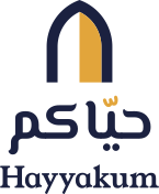



Hayyakum (حيّاكم) looks after a wedding's invitations, replies and door check-in. These guidelines cover the name, the voice, the colours, the type and the logo. They apply to hayyakum.om, the product's own screens (sign-in, the team's dashboard) and anything we send. They never apply to a couple's invitation: every couple brings their own theme, and Hayyakum steps back.
Name and meaning
حيّاكم is how the Gulf says welcome: "you're all welcome", "may God keep you alive", said at the door as guests arrive and again as they sit down. It's plural and warm, and it's what a host says, not a salesman.
The name covers the whole journey the product looks after: the invitation that says you're welcome, the reply that says we're coming, and the moment at the door when an usher says it out loud.
- Arabic: حيّاكم, always with the shadda. Never حياكم in the logo or headings; body text may drop it only where diacritics are dropped throughout.
- Latin: Hayyakum, one word, capital H. Not HayyaKum, Hayakum or Hayyakom.
- Domain: hayyakum.om, lower case.
Positioning
Invitations, replies and check-in in one place (الدعوات والردود والدخول، في مكان واحد), for weddings in Oman and the Gulf first, with other celebrations later.
Be honest about where we are: today Hayyakum is built for weddings. Say "other celebrations are coming", never imply we already handle conferences, birthdays or ticketing. Don't claim payments, email invitations or text-message sign-in, which don't exist yet.
What we stand on, in this order:
- Made for Omani and Gulf weddings. Families, not individuals. The groom's side and the bride's side. Arabic names searched as they are written.
- WhatsApp first. Guests need no app and no email. Everything reaches them where they already talk.
- Arabic first. Right to left done properly, Arabic numbers and plurals, with English beside it.
Voice and tone
Warm, clear and respectful, the way a good host speaks. Arabic first; English is a peer, not a translation afterthought.
- Plain verbs. "Send on WhatsApp", «أرسل على واتساب». Not "Leverage our messaging integration".
- Address the couple in the plural in Arabic (أنتم، أرسلوا، ضيوفكم), and as "you" in English.
- Say what happens. A button names its action, and the confirmation uses the same word: "Send" → "Sent".
- Calm about problems. Say what went wrong and what to do next; no apologies, no alarm. "Contact opens soon", «سنفتح التواصل قريبًا».
- No hype. No "revolutionary", "seamless" or "effortless". No exclamation marks in the product, one at most in a greeting.
- Numbers the local way. Arabic-Indic digits (١٢٣) in Arabic text; Arabic counting rules (مكان واحد، مكانان، ٣ أماكن، ١١ مكانًا).
- Sample content is fictional. Sara & Omar (سارة و عمر), the Al Hashmi family (عائلة الهاشمي). Never a real couple, venue or date.
| Instead of | Write |
|---|---|
| RSVP management platform | Replies from every guest, by name |
| Guests must download our app | Guests need no app |
| Seamless check-in experience | Your ushers scan passes at the door |
| منصة متكاملة لإدارة الفعاليات | الدعوات والردود والدخول، في مكان واحد |
Colour
The palette is the night of an Omani wedding: a deep night-sky ink, the saffron light of an open door, warm sand, a fresh monsoon green and a lot of warm white. It deliberately avoids the colours couples tend to choose for their own invitations (olive and buttercream, oxblood and ivory, blush and gold), so the brand can sit beside any of them.
| Token | Name | Hex | Role |
|---|---|---|---|
layl | Night ink (ليل) | #1B2140 | Text on light; dark surfaces, the hero and the footer |
layl-raised | Raised ink | #262D52 | Cards and disabled buttons on ink |
layl-line | Ink line | #39426E | Hairlines and outlines on ink |
zafaran | Saffron (زعفران) | #E2A53B | The lit door; the main button on ink; accents |
zafaran-deep | Deep saffron | #8C5A06 | Saffron as text or focus rings on light |
khareef | Monsoon green (خريف) | #1E6B5E | Arrival, success, "coming" |
raml | Sand (رمل) | #F2E9DA | Quiet sections |
laban | Warm white (لبن) | #FCFAF6 | The page; text on ink |
muted | Muted ink | #4E5470 | Secondary text on light |
muted-dark | Muted on ink | #C3C7DB | Secondary text on ink |
Contrast (WCAG 2.1). Checked pairs, all AA or better for body text unless noted:
| Foreground on background | Ratio | Use |
|---|---|---|
| Night ink on warm white | 15.1:1 | Body text |
| Night ink on sand | 13.0:1 | Body text |
| Muted ink on warm white | 7.1:1 | Secondary text |
| Muted ink on sand | 6.2:1 | Secondary text |
| Saffron on night ink | 7.2:1 | Accents, buttons |
| Night ink on saffron | 7.2:1 | Button labels |
| Muted-on-ink on night ink | 9.4:1 | Secondary text on dark |
| Muted-on-ink on raised ink | 7.9:1 | The disabled button's label |
| Deep saffron on warm white | 5.6:1 | Links and focus on light |
| Monsoon green on warm white | 6.1:1 | Status text |
| White on monsoon green | 6.3:1 | Arrival verdicts |
| Saffron on warm white | 2.1:1 | Never for text. Shapes only (the door's light) |
Proportions: roughly 60% warm white and sand, 30% night ink, 10% saffron and green together. Saffron is light, not paint: one lit thing per view.
Typography
All four families are under the SIL Open Font License and are self-hosted (the site's CSP allows fonts from 'self' only; next/font downloads them at build time and serves them from our domain).
| Role | Arabic | Latin |
|---|---|---|
| Display: headings, the wordmark | El Messiri 600/700 (Mohamed Gaber) | Young Serif 400 (Bastien Sozeau) |
| Text: body, UI, buttons | IBM Plex Sans Arabic 400/500/600 | Instrument Sans 400/500/600 |
Why these: El Messiri is a contemporary Naskh-Kufi hybrid, open and round like the arch in the symbol, and very legible at display sizes on phones. Young Serif shares its soft, slightly flared weight, so the two wordmarks sit together as one voice. Plex Sans Arabic is already the product's Arabic UI face; Instrument Sans is a calm grotesque that doesn't compete with it.
- Scale (Arabic page, 17px body): 17 body · 20 lead · 21 card title · 32–46 section title · 36–64 hero. The English page uses 16px body and the same steps.
- Line height: Arabic body 1.8, Arabic headings 1.3–1.45 (room for marks above and below); English body 1.65, English headings 1.1–1.2.
- Line length: under 80 characters; body copy sits in a 34–40em column.
- Instrument Sans spaces tightly, so English body text gets
word-spacing: 0.06em. - No all-caps labels, no letter-spaced eyebrows. Bold is 600, only for names and titles.
- Don't mix scripts inside one heading. A Latin word in Arabic text (Excel, QR, iPhone) is set in the text face and left as it is.
Logo
The symbol: the open door
A two-centred Omani arch, the shape of doorways from Nizwa to Muscat, drawn on a 64-unit grid.
- Outer arch: 48 wide, springing at 36, both arcs of radius 36; base at 62, crown at 2.
- Frame: 8 units everywhere. The inner arch shares the outer arch's centres (radius 28), so the crown is as thick as the jambs.
- The doorway is split down the middle into two leaves. One leaf stands open and the light comes through it in saffron; the other shows whatever is behind the logo. On Arabic layouts the lit leaf is the start (right) side, where the guest steps in.
It is the whole product in one picture: an invitation is an open door, and the evening ends at a door where someone says حيّاكم.
Wordmarks
- Arabic «حيّاكم»: El Messiri Bold, shaped with HarfBuzz and converted to outlines, so it renders without the font. The shadda is saffron, the only mark that takes the accent colour: it's the emphasis in the word, like the light in the door.
- Latin "Hayyakum": Young Serif, converted to outlines.
- The wordmarks are never retyped in a live font for the logo; use the files.
Lockups and files
All in web/public/hayyakum/, built by web/scripts/hayyakum/build-logo.mjs (wordmark outlines from shape-wordmarks.py).
| File | Use |
|---|---|
lockup-horizontal-ar.svg | Default on Arabic layouts: symbol at the start (right), «حيّاكم» after it |
lockup-horizontal-en.svg | Default on English layouts: symbol, then "Hayyakum" |
lockup-stacked.svg | Square spaces, splash screens, the link preview: symbol, «حيّاكم», "Hayyakum" |
symbol.svg | Where the name is already present or space is tight |
wordmark-ar.svg, wordmark-en.svg | Wordmarks alone (rare) |
…-reverse.svg | The same on night ink: warm white frame, saffron light |
…-mono.svg | One colour (night ink), for engraving, stamps, fax-quality print |
favicon.svg, favicon.ico, icon-192.png, icon-512.png, apple-touch-icon.png | The symbol reversed on a night-ink tile |
og.png (1200×630) | Link previews |
Clear space
Keep clear space around the logo equal to the frame width × 2 (16 units on the 64 grid, a quarter of the symbol's width). Nothing (text, edges, other logos) enters it.
Minimum sizes
- Symbol: 16px tall on screen (favicon tile at 16px), 6mm in print.
- Horizontal lockup: 28px tall on screen, 10mm in print. Below that, use the symbol alone.
- Stacked lockup: 64px tall on screen.
Do
- Use the files as they are, on warm white, sand or night ink.
- Use the reverse versions on night ink, and on photos only over a calm, dark area.
- Keep the saffron leaf on the start side of Arabic layouts (the files already do).
Don't
- Don't recolour the frame in saffron or the light in any other colour.
- Don't fill both leaves, add a keystone, a crescent, a dome or stars to the arch.
- Don't stretch, rotate, outline, shadow or put the logo in a box (except the app-icon tile).
- Don't set the name in another font, or drop the shadda from the Arabic wordmark.
- Don't put the logo on a couple's invitation page. Their page is theirs; Hayyakum appears at most as a quiet "made with Hayyakum" text link in the footer.
Iconography and illustration
- Icons: simple line icons on a 24-unit grid, 1.8-unit stroke, round joins, in the text colour. Filled only for states (a check in a circle for "arrived").
- The arch is our shape. Numbered steps sit in small arches; the last step (the door) is the one that's lit. Use it for structure, not as wallpaper.
- Product pictures, not photos. Show the product as drawn mockups (a phone with an invitation, the replies board, an usher's verdict, a WhatsApp message) built in HTML/CSS/SVG. They stay sharp, translate with the page, and never show a real guest.
- Sample invitations wear a neutral sample theme (dusty blue on pearl), never the brand palette and never a real couple's theme, so it's clear the couple's look is theirs.
- Photography: none. No stock couples, no hands with rings, no venues. If we ever show a real event, it's with the couple's written permission and none of their guests' details.
Motion
One orchestrated moment per page: on the landing page the door's light opens, then the invitation rises into the doorway and the message and the welcome arrive. Everything else is still. Motion answers people's actions (opening a question, pressing a button). Everything respects prefers-reduced-motion.
Technical notes
- The site's CSP is
script-src 'self' 'unsafe-inline'andfont-src 'self': no third-party scripts, fonts, analytics or trackers. - Never format dates or numbers with
Intlduring a client component's first render (iOS and the server disagree and the page re-renders); use the digit maps in the code.